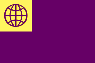
I admit that I believe the “Globe flag” below meets these criteria best. The old logo is not simple; the Globe represents “Vol”, retaining the schematic meridians for longitude and latitude that are found in the original logo; Purple and Gold are traditional colours; it uses no text; the basic shape is reminiscent of the Esperanto flag (a dark field and a light canton with symbol in the first colour)—I think that evocation is a good one, and makes Volapük look like an equal.
The Globe flag

Image by Michael Everson, 2010-08-31This is now my favourite. Simple. The image is a schematized globe symbolizing the world: simple, bold, easy to draw and remember. In terms of "competing" with the Esperanto flag, this is the most appealling, in my opinion. It would be legible at small sizes too:

|
Esperanto flag

Image by António Martins, 2004-03-16The Esperanto flag for comparison.
|
Conjectural flag

Image by António Martins, 1999-06-05Simply places the logo on a white field. In my opinion, not very inspiring.
|
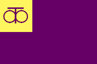
Monogram flag

Image by António Martins, 2010-08-30Uses an evidently-attested monogram. The colours should be modified. I am not sure of the placement of the letters. Directionality of the text would be a problem when the flag were reversed. "Menad bal pük bal" might be mnemonic, but I honestly don't see it in this. If anything when I squint it looks like a tree.
|
The Circled Cross flag

Image by Michael Everson, 2010-08-29This used to be my favourite, though now I favour the Globe flag. The charge in the canton is the astronomical symbol for Earth.
|
Schematized monogram flag

Image by Michael Everson, 2010-08-30An attempt at schematizing the monogram in a non-directional way. Reminds me of the Wizard of Oz somehow.
|
Mauve Globe flag

Image by Michael Everson, 2010-08-30Here is a version in the colour "Mauve". This is fairly nice looking.
|
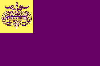
Logo flag

Image by Michael Everson, 2010-08-29This just places the logo in the canton. It would be quite fussy to draw.
|
Old Mauve Globe flag

Image by Michael Everson, 2010-08-30Here is a version in a darker shade of mauve. This is called "Old Mauve". I don't think it works.
|
Radu's logo flag

Image by Michael Everson, 2010-08-29Here is a proposal from Radu Chinan. This is an attractive enough image, but it violates almost all of the rules of a good flag. Complicated design, many colours, text. It would be fairly hard to make this legible at small sizes:

|
The French Lilac Globe flag

Image by Michael Everson, 2010-08-30Here is a version with a more "lilac" shade of purple. This is called "French Lilac" |
Schematized logo flag

Image by Michael Everson, 2010-08-30Here I just sketched out a schematized version of the old logo. The schematization wasn't very successful, but in any case it doesn't say “Volapük” to me.
|
The Deep Lilac Globe flag

Image by Michael Everson, 2010-08-30Here is a version with a more "lilac" shade of purple. This is called "Deep Lilac" |
Logo flag with stripe

Image by Michael Everson, 2010-08-30Here is another idea from Radu Chinan. In Radu's original design the logo was a bit smaller. I think the logo is far too complicated to work in this position, and the stripe makes the flag look like one of those old Soviet Republics.
|
The Rich Lilac Globe flag

Image by Michael Everson, 2010-08-30Here is a version with a more "lilac" shade of purple. This is called "Rich Lilac". Too pink. |
Cadeuceus flag

Image by Michael Everson, 2010-08-29As others pointed out, the cadeuceus has been co-opted for other purposes, and this doesn't say “Volapük”.
|
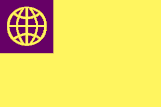
Inverse Globe flag

Image by Michael Everson, 2010-08-30I wanted to see what this looked like reversed. A bit too bright.
|
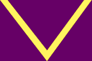
Purpure, a chevron inverted throughout Or

Image by Michael Everson, 2010-08-30Here is a version of an idea by Radu Chinan. I have seen no other flags with this design feature; in heraldry a chevron usually points upward. Basically this is a very big V, and in my opinion using a chevron to indicate the letter is not very subtle or appealing.
|
Cantonless Globe flag

Image by Michael Everson, 2010-08-30Here is modification of that, with the Globe symbol in the canton position |
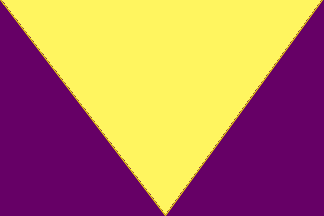
Purpure, a pile Or

Image by Michael Everson, 2010-08-30There are flags which use a pile, though generally they put something in it. I put this here just to see, but I don't like it. |
Nordic flag

Image by Michael Everson, 2010-08-30A “Nordic Cross” style flag. Excellent for Volapükists from Iceland....
|
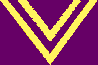
Another Chevron flag

Image by Michael Everson, 2010-08-30Still a V. Still a bit unconvincing. |
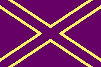
Saltire flag

Image by Michael Everson, 2010-08-30A “Saltire” style flag, for Volapükists from Scotland, perhaps.
|
Motto flag

Image by Michael Everson, 2010-08-30I believe this was Paul Bartlett's suggestion: “I would go for the color scheme with just the motto without the maps and cadeuceus.” |
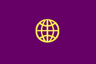
Centred Globe flag

Image by Michael Everson, 2010-08-30Here is an idea from Radu Chinan, putting the Globe symbol in the centre of the flag.
|
Semicircle with V flag

Image by Michael Everson, 2010-08-31Another idea from Radu Chinan, putting a V inside a circle. Evidently this is slightly reminiscent of Mazda’s logo, so that wouldn't be so good.
|
